Color run layouts
When asked to show breadth of product for spring, I was inspired by the sheer amount of fun color in the collection. So, I created a rainbow of product to not only be visually pleasing, but also to get the consumer to scroll down the email.
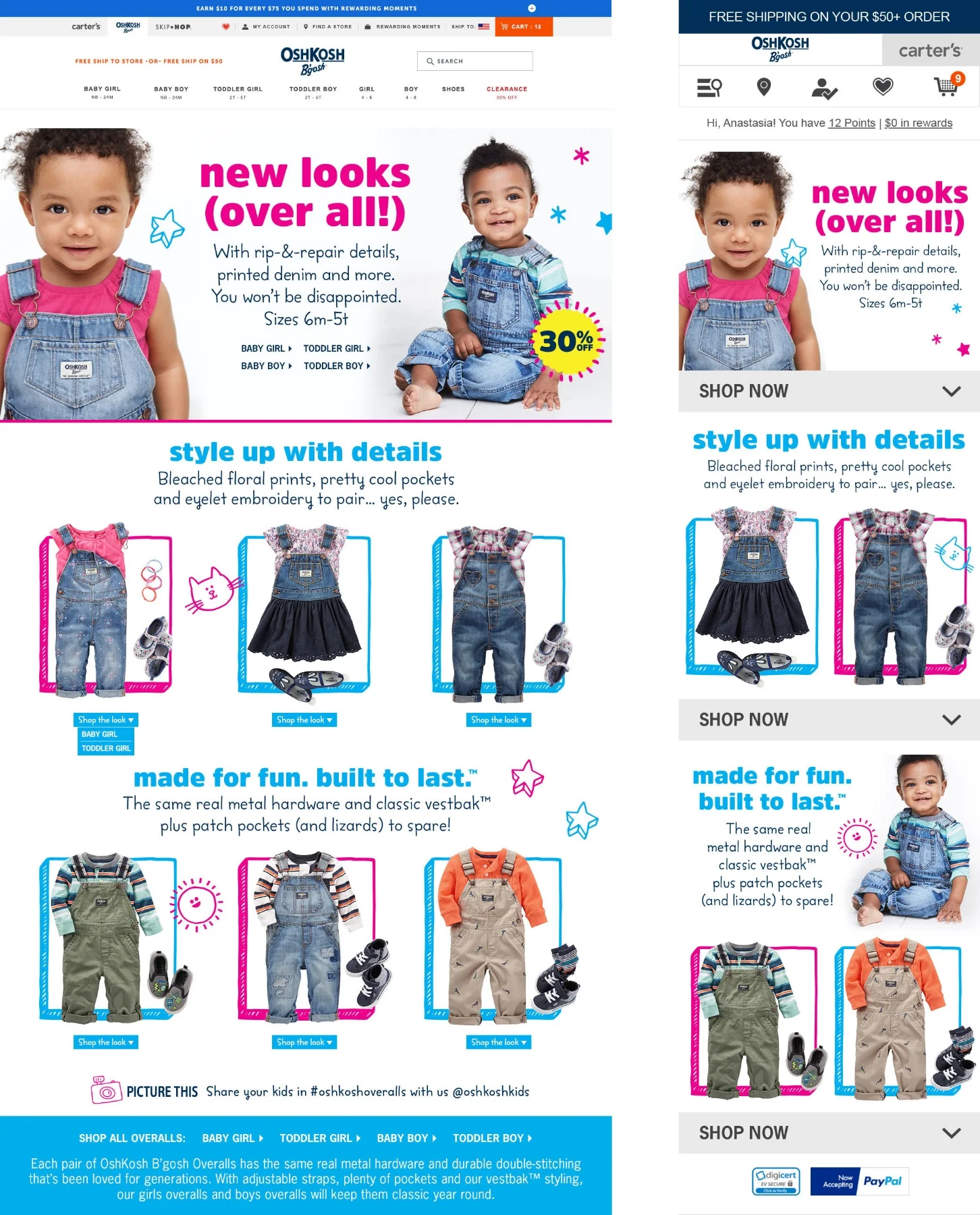
World's Best Overalls shop
Redesigned landing pages for both desktop (left) and mobile (right) while implementing the new design elements for Q3. I loved working with the fresh fun colors and doodles, not to mention the classic overalls of OshKosh B'gosh.
Abandoned Cart emails
Sometimes I just create a hero asset that lives on top of generated content, like in these emails. When a shopper leaves something in their cart and doesn't checkout, they'll get a reminder email with the items from their cart populated underneath. Now none of that computer wizardry is my doing, I just make the pretty asset that lives on top. These were redesigned for Q3 with the updated look and feel of the brand.
Clearance email
Every once in a while, I get to make something that moves! (which is one of my passions, if you couldn't tell from this portfolio) I created this using pre-shot stacks of clothing and Photoshop's handy-dandy timeline. The disappearing stack adds to the sense of urgency to buy before it's gone.
Mix Kit Landing Page
I don’t always get to develop a project from start to finish. Some projects get handed off for finishing touches or, in this case, for animation. Working closely with my art director and the web developers, we were able to animate this page smoothly without sacrificing website performance. It took quite a few tries to get it right, but it was worth the effort.


