Dr. Seuss Redesign
I redesigned these classic Dr. Seuss books into a specialty set, complete with a coloring poster. It was difficult to illustrate an illustrator, so I modified the perspective in the Sneetches cover and adjusted the point of view for Fox in Socks. I kept the original copy from the back of the Fox in Socks book.


Henckel Catalog
This catalog highlights the excellent quality of Henckel knives in a surprising manner. The imagery supports the quirky and fun dialog. The idea hit me one night while preparing dinner. The potato I was cutting looked like it had a face and I thought, what else could this knife do that is unlikely. I felt like these prestigious knives needed to go have some fun. After creating story boards for each photograph, I set out to on an adventure with my camera.
Some of the photographs I was able to pull from my library and others I shot just for this purpose. Whenever something is interesting enough that I want to stare at it, I grab my camera and photograph it. I love to find unique situations, textures and patterns. So I already had the image of a broken windshield and the dam leaking in my photo library. I rounded out the catalog with some color from nature with the flower peeling, some common kitchen items, and the utility lines.
Scoop Flour
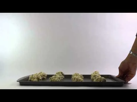
My team invented Scoop flour for the 48 hour repack challenge of 2015. My role was concepting, design, and video editing. Some of the illustrations that you see on the inner label are mine and some are my teammates.
Fish Out of Water
A photographic typeface designed for outdoor enthusiasts, photography lovers, and fishmongers. I shot this during a local fishing derby. This was one of those happy accident moments. I was photographing the event and realized that the guts laying on the table looked like a letterform. There were so many things around that mimiced letters. I ran around the rest of the afternoon shooting hooks, sinkers, reels, and fish guts to get each letter of the alphabet. Before you could fry up dinner, Fish Out of Water was created.
7 Sins of Parenting
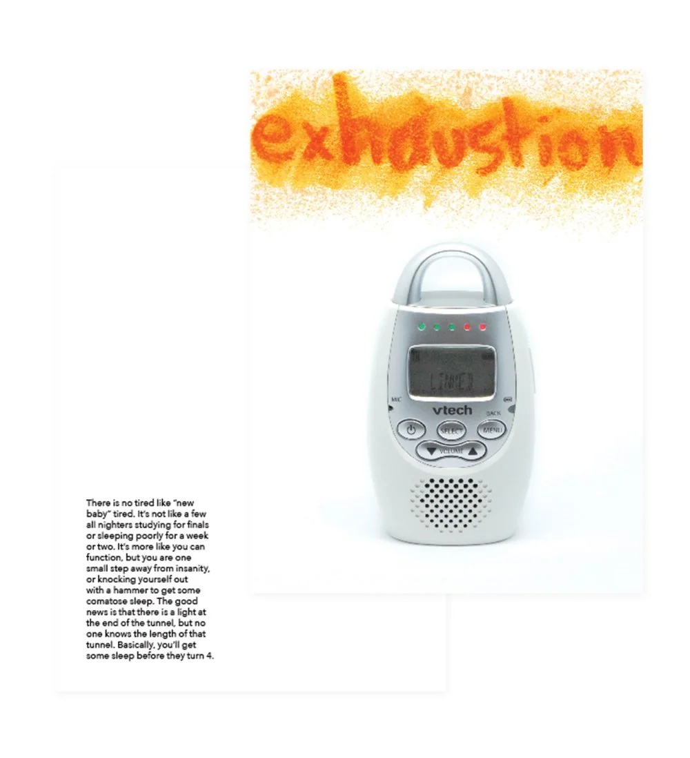
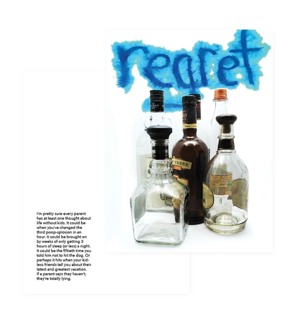
I know that there are more than just these 7, however I think these cover some of my biggest pet peeves. I wrote the copy on the back to give a lighthearted tone to them. For the headlines, I wrote each on watercolor paper with lipstick. Smearing the lipstick with different things, like my finger, paper, a q-tip, gave each one some personality. After photographing them, I adjusted the colors to coincide with each sin.
Atlanta Jewish Music Festival
Every year, one of our professors collaborated with the director of the AJMF. Everyone on the class designed 2 posters with the given color palette and list of band names. One winner was chosen to have their poster screen printed for the event. While I didn't win, it was a fun project and great experience working with a client.


